The True Cost of Clean Energy: How Electricity Prices Are Really Changing
New research reveals that clean electricity prices are more stable than they appear when adjusted for inflation. The data shows promising economic trends in global energy transformation.
In a groundbreaking data visualization that's sparking conversations about clean energy economics, two seemingly contradictory charts are revealing a nuanced story about electricity pricing and decarbonization. Created by Michael Caravaggio from the Electric Power Research Institute (EPRI), these charts track electricity prices and carbon intensity across the world's top ten electricity-producing countries between 2015 and 2024, uncovering a complex narrative that challenges simple assumptions about green energy costs.
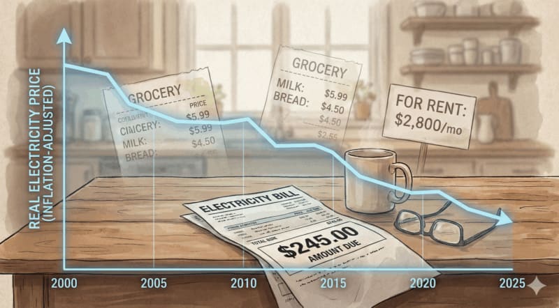
The charts present a fascinating optical illusion of sorts: one showing nominal electricity prices, which appear to rise as electricity systems become cleaner, and another adjusted for inflation, which tells a dramatically different story of prices remaining flat or even declining. This visual puzzle captures the heart of a critical misunderstanding about the economic trajectory of clean energy transformation.
By examining household electricity rates against carbon dioxide intensity, Caravaggio's research reveals that while consumers might feel prices are increasing, the economic reality is more nuanced. Carbon intensity across the sample countries typically falls by 150 to 400 grams of CO2 per kilowatt-hour, with nominal prices rising between $0.02 and $0.10 per kWh. However, when inflation is factored in, those same prices often drop by $0.01 to $0.05 per kWh – a significant difference that challenges popular perceptions.
The research highlights the importance of understanding electricity system transitions, which move through distinct phases. Early transition systems remain fossil fuel-dominated and focus on capacity expansion, while mid-transition systems rapidly build renewable infrastructure, transmission, and storage. Mature low-carbon systems, like France and Canada, operate with largely paid-off infrastructure and demonstrate more stable pricing dynamics.
Take France as a prime example: generating over 80% of its electricity from low-carbon sources, primarily nuclear power built between 1977 and 1992, the country shows how mature clean energy systems can maintain relatively stable pricing. With a carbon intensity around 50 grams of CO2 per kWh, France's electricity pricing reflects decades of infrastructure investment and strategic energy planning. Similarly, Canada's hydro-dominated grid, with a national carbon intensity near 120 grams of CO2 per kWh, demonstrates another pathway to clean, affordable electricity.
Caravaggio himself acknowledges the complexity, noting a critical caveat: many workers' wages aren't keeping pace with inflation, which means even stable pricing can feel like an increasing burden. This insight underscores the need to view clean energy transitions not just through technical or economic lenses, but through the lived experience of everyday consumers.
Ultimately, these charts tell a story of hope and progress. They reveal that the global transition to clean electricity is not just environmentally necessary, but increasingly economically sensible. As countries continue to decarbonize, the data suggests we can expect more efficient, cleaner, and potentially more affordable electricity systems – a message of optimism in the ongoing fight against climate change.
Based on reporting by CleanTechnica
This story was written by BrightWire based on verified news reports.
More Good News
 🌍 Planet
Global Communities Resilient in Face of Unprecedented 2025 Flooding Challenges
 🌍 Planet
Maryland Transforms Coal Mine into Innovative Solar Power Hub, Powering 30,000 Homes
 🌍 Planet