The Hidden Truth Behind Electricity Costs: A Tale of Transformation
Two revealing charts expose the complex journey of electricity pricing and decarbonization. Explore how clean energy is reshaping our understanding of power economics.
Energy economics can be deceptively complex, as revealed by two extraordinary charts that tell dramatically different stories about electricity pricing around the world. Created by Michael Caravaggio from the Electric Power Research Institute (EPRI), these visualizations expose a nuanced narrative about how electricity systems are transforming, challenging popular assumptions about clean energy costs.
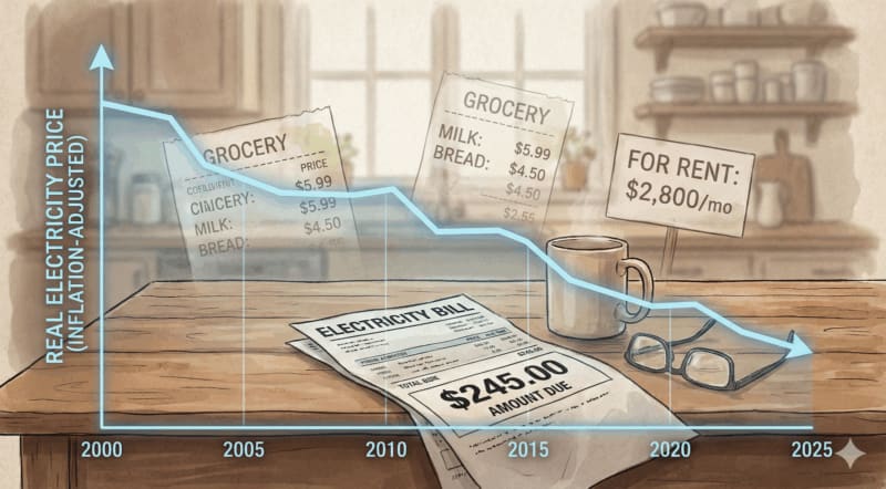
The charts track household electricity rates and carbon dioxide intensity across ten major electricity-producing countries between 2015 and 2024. At first glance, they seem contradictory: one chart suggests electricity prices rise as grid systems decarbonize, while an inflation-adjusted version reveals prices are actually flat or declining. Both perspectives are simultaneously true, representing different economic realities that consumers and policymakers experience.
When examining the data, the magnitude of change becomes fascinating. Carbon intensity typically falls by 150 to 400 grams of CO2 per kilowatt-hour during this period. Nominal prices rise by $0.02 to $0.10 per kilowatt-hour in several cases, but when adjusted for inflation, those same prices often drop by $0.01 to $0.05 per kilowatt-hour. These aren't just snapshots, but trajectories showing complex energy system transitions.
Caravaggio himself acknowledges the complexity, noting that wage stagnation means inflation-adjusted pricing might feel less meaningful to many consumers. The charts reveal that electricity systems move through distinct phases: early transition systems dominated by fossil generation, mid-transition systems building renewables and infrastructure, and mature low-carbon systems operating with established infrastructure.
Countries like France and Canada exemplify mature low-carbon systems. France generates approximately two-thirds of its electricity from nuclear power, with over 80% coming from low-carbon sources. Its carbon intensity hovers around 50 grams of CO2 per kilowatt-hour, largely due to a nuclear fleet built between 1977 and 1992. While nominal electricity prices increased between 2015 and 2024, inflation-adjusted increases were minimal, reflecting existing infrastructure investments rather than new decarbonization costs.
Canada presents a similar pattern, with hydropower dominating its generation and national carbon intensity near 120 grams of CO2 per kilowatt-hour. The charts demonstrate that as electricity systems mature, the economic burden of transitioning to clean energy stabilizes, offering hope for a sustainable energy future.
Understanding these nuanced transitions is crucial for public perception and policy-making. While consumers might feel electricity costs are rising, the underlying economic reality suggests a more optimistic narrative of technological progress and environmental responsibility. These charts aren't just data points; they're a testament to human innovation in confronting climate challenges.
Based on reporting by CleanTechnica
This story was written by BrightWire based on verified news reports.
More Good News
 🌍 Planet
Innovative Solar Solution: ZOUPW 450W Portable Panel Revolutionizes Off-Grid Power Generation
 🌍 Planet
Conservation or Displacement? The Complex Story of Tanzania's Game Reserves
 🌍 Planet
Electric Vehicle Giants BYD and Tesla Dominate Global Battery Electric Vehicle Market
Start Your Day With Good News
Join 50,000+ readers who wake up to stories that inspire. Delivered fresh every morning.
No spam, ever. Unsubscribe anytime.